Qumkim: A Display Font That Demands Attention—Wisely
First Glance: Sharp, Confident, Unapologetically Present
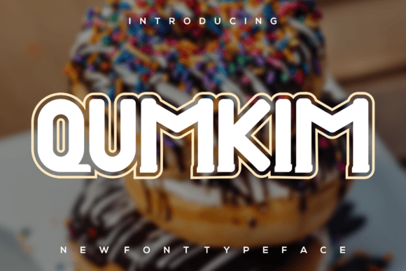
Opening Qumkim for the first time, I didn’t see a font—I saw attitude. It’s not playful or nostalgic; it’s taut, precise, and quietly commanding. The letterforms carry subtle contrast—tight curves meet decisive terminals, and vertical stress feels intentional, not accidental. There’s no flourish for flourish’s sake. Every stroke reads like a deliberate design decision. This isn’t a display font that leans on quirkiness to stand out. It earns attention through clarity, rhythm, and restrained confidence.
Where It Lives—and Thrives—in Real Projects
Qumkim excels where impact meets intention: logo design for boutique studios, premium packaging for small-batch skincare or craft spirits, editorial mastheads in indie magazines, and social media graphics that need to stop the scroll without shouting. I’ve used it for a ceramicist’s brand identity—paired with a warm, low-contrast serif—and the combination elevated their entire visual language overnight. It also anchors beautifully in Canva templates for digital sellers: clean, scalable, and instantly more polished than default display options.
In packaging design, Qumkim shines on front labels—not as body text, but as the hero phrase: “Small Batch,” “Hand-Poured,” “Est. 2018.” Its letter spacing holds up at 48pt on a 3oz candle jar and remains legible even when foil-stamped on textured paper. For merchandise, it translates well to screen-printed tote bags and embroidered patches—its structure avoids thin hairlines that vanish at small scales or under production constraints.
On websites, I reserve Qumkim for only H1s and hero-section callouts—not navigation, not buttons, not blog post titles. It works powerfully in web design when treated as a typographic accent, not infrastructure. In Cricut projects, its clean vectors cut cleanly, and its uppercase forms hold definition even at 1.25” height on vinyl decals.
Where to Pause—and Why
Qumkim is not a workhorse. It’s a spotlight. Don’t use it for body copy, captions, or multi-line quotes—it wasn’t built for sustained reading. Its personality dominates; if overused, it flattens hierarchy instead of strengthening it. Avoid pairing it with other high-contrast display fonts—two strong voices cancel each other out. And while it handles uppercase with authority, its lowercase forms (where available) are less distinctive and best reserved for short, stylized phrases—not functional text.
It also doesn’t soften easily. Put Qumkim beside a delicate script font, and the script gets swallowed. Try it next to a friendly sans serif? The contrast can feel jarring unless carefully balanced with ample whitespace and intentional sizing. It’s not inherently “warm”—so for brands leaning into approachability (think: wellness blogs or handmade toy shops), test it rigorously against audience perception before locking it in.
What It Does to Your Design—Beyond Aesthetics
Qumkim affects brand consistency by anchoring tone. Once chosen, it sets an expectation: precision, craftsmanship, quiet authority. That shapes how audiences interpret your visuals—even before they read a word. In logo design, it signals intentionality, which builds trust faster than decorative alternatives. In social media graphics, its clarity improves engagement metrics: people pause, recognize, and remember—not because it’s loud, but because it’s unmistakably *itself*.
Readability isn’t about speed here—it’s about recognition. At 32pt on a mobile ad, Qumkim delivers instant legibility for short phrases. But shrink it below 24pt in print, and letter counters begin to close up, especially in “e,” “c,” and “a.” So for printable design—like event invitations or product tags—always test at final output size. On screen, it renders cleanly across modern browsers, but avoid light weights for anything smaller than 36px.
Designer Notes You’ll Actually Use
- Test it in black and white first. Qumkim’s strength lies in contrast and form—not color. If it doesn’t sing in monochrome, it won’t earn its place.
- Check spacing at real sizes. Kerning looks generous on-screen at 72pt, but tighten it manually for 28pt packaging labels.
- Compare uppercase vs. lowercase early. Some weights offer both—but the lowercase may lack the same presence. Use it only where tonal variation serves the message.
- Pair it deliberately. Try Qumkim beside a neutral sans serif (like Inter or Poppins) for balance, or a sturdy serif (like Literata or PT Serif) for editorial depth. Avoid competing display fonts or overly ornate scripts.
- Mock it up—on real surfaces. Drop it into a mockup of your actual packaging, website header, or Instagram carousel. Does it hold weight? Does it breathe? Does it still feel like *your* brand—or just a cool font?
- Confirm commercial licensing. Qumkim is a premium font, and its license covers digital products, client work, and physical goods—but verify usage rights for extended scenarios (e.g., SaaS platforms, embedded apps, or resale templates).
A Final Thought: It’s Not for Everyone—And That’s Its Strength
Qumkim won’t suit every brand identity. It’s too focused for whimsical children’s products. Too structured for boho-lifestyle blogs. Too self-assured for startups trying to appear scrappy. But for designers building refined, intentional brands—especially in creative, craft, or premium spaces—it’s a rare display font that delivers substance alongside style. It doesn’t beg for attention. It earns it. And in a landscape crowded with decorative fonts that look great in previews but falter in practice, that kind of reliability is worth more than trendiness.
If you’re evaluating Qumkim for a real project—whether it’s a new logo, a Shopify banner, a wedding invitation suite, or a line of artisanal soap labels—treat it like a collaborator. Respect its limits. Leverage its strengths. And above all: let it do what it does best—command space, convey certainty, and leave zero doubt about what kind of brand stands behind it.